
Cannondale.com Product Detail Page Refresh
My Process: The product detail page for Cannondale that hadn't been redesigned in years, so I led research by running workshops with product management, reviewed heatmaps and click data, and pulled findings from user testing. Users told us they'd bounce if specs weren't easy to find, they were getting stuck in a sizing modal they couldn't close, and mentioned that our zoom feature wasn't easy to use.
Based on these findings, I restructured the information hierarchy. I brought specs, geometry, and reviews higher up on the page, added a sticky add-to-cart nav, redesigned the sizing modal to make it easier to use and designed a new image viewer with zoom features that enabled users to see more of the bikes up close.
The Result: There was a 50% increase in clicks to product specifications, an increase in the usage of the size finder by 20%, and engagement with the product photography increased by 15%.
MOBILE
LEFT: BEFORE | RIGHT: AFTER
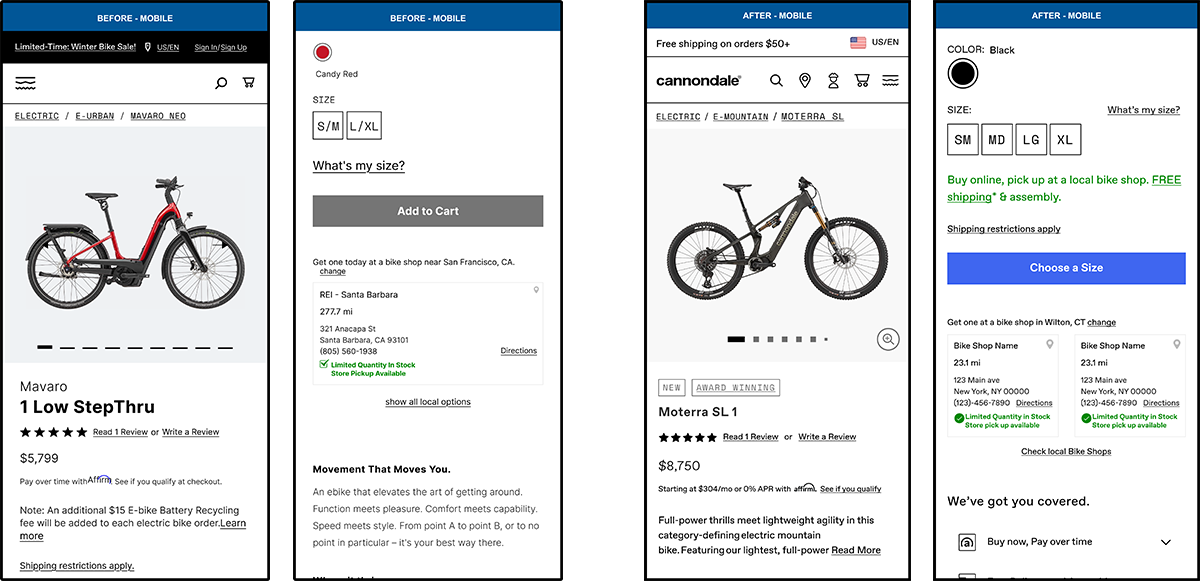
VIEW MOBILE PROTOTYPE
This is a limited prototype and will open in a new tab.
Desktop
LEFT: BEFORE | RIGHT: AFTER
VIEW Desktop PROTOTYPE
This is a limited prototype and will open in a new tab. If you would like a walk through please contact me.
Full Case Study
RESEARCH
i conducted a brainstorming workshop in fig jam between UX and Product Management to align on goals for the PDP refresh project. Together we reviewed heat maps and click maps generated from hot jar as well as reviewed current design patterns for both competitors and non-competitor’s PDP pages. Below are the goals our research and brainstorming generated.
• Optimize above the fold
• Understand images we have & how to make them better / better showcase our bike visually to our customers. Better photo experience on PDP.
• Offer our users a better sizing experience on PDP
• Get users to checkout/conversion as quickly as possible
• Getting users to understand delivery methods
• Users understand the Cannondale reasons to buy (brand strength & communication of standing behind product)
• How to optimize the spec data so that users understand what they’re getting in their Cannondale purchase
• Incorporating ways to zoom into the product more efficiently will help users see features of the bikes more easily.
USER TESTING
I gathered findings across a couple years of our general “Find my Bike” user tests. Some of findings that helped inform our design designs on the PDP redesign are as follows:
• Reviews are very important to users when considering a purchase
• Users mentioned that they would leave a page if specs and technical information were not easier to find.
• Users struggled with the current UI design of the sizing modal. They couldn’t close out of the modal easily on desktop. Reading the results of the chart were not always clear. Content was cut off on mobile due to unnecessary spacing at the top of the viewport.
REQUIREMENTS
• We wanted to optimize scroll depth and above the fold
• Enhance product discovery through updated content organization and UI design
• Optimize information hierarchy while working within our existing content framework
• Maintain strong conversion rates
• Modernizing the overall look and feel
• Enhancing our product photo experience
• Updating the the sizing experience so it’s easier to use
• Get users to checkout/conversion as quickly as possible
• Getting users to understand delivery methods
• Ensure users understand the Cannondale reasons to buy to increase brand strength & communication for our products
• Optimizing the spec data so that users get the information they need for the product they are researching/ buying
FUNCTIONALITY Updates
• Increased the visibility of the following areas: Specs, Geometry and Reviews by bringing them higher up on the page so the user can get to the information quickly.
• Implemented a drop down navigation to appear when the user scrolls past the ATC button so that they can easily add the product to cart where ever they are on the page.
• Added the image viewer with a zoom feature so the user could examine the details of the bikes components more closely.
• Added an Overview paragraph to the right rail so users can be brought to the key information about the bike faster
• Added reasons to buy drawers so the user could view our reasons to buy more easily.
• Redesigned the “What’s my size?” modal so users could quickly close it when needed and not get trapped within a modal they can’t close.
MEASUREMENT OF SUCCESS
• Increased the views to product specs by 50%
• Increased the usage of the size finder by 20%
• Engagement with the product photography increased by 15%