
Cannondale.com Checkout Redesign
My Process: To kick off the redesign, I pulled the team together, leading research and workshops with our product managers to align on what would improve the flow. I benchmarked competitors, big-box e-commerce leaders, and Baymard research to ground our assumptions in real user behavior, not internal opinion.
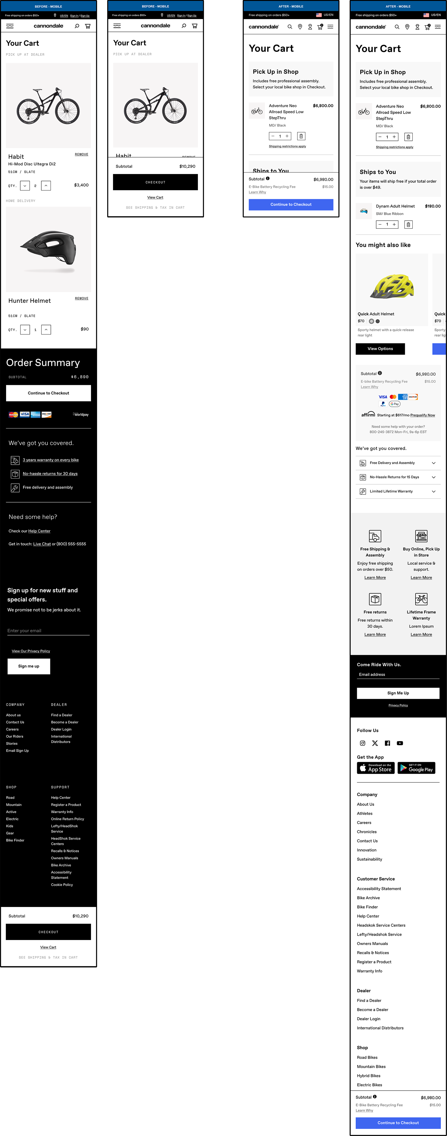
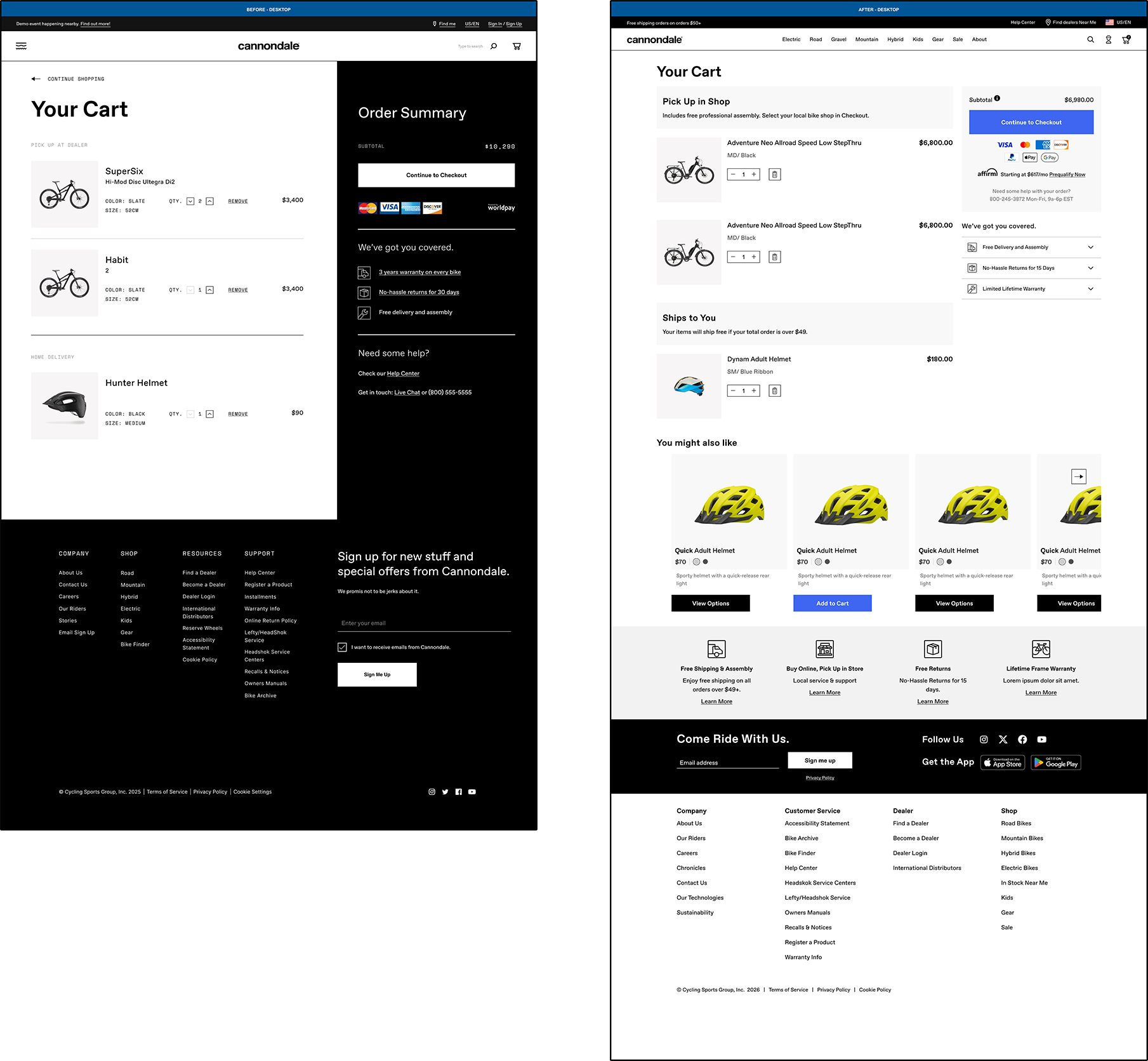
That research set our priorities: a mobile-first rebuild, tighter accessibility (fixing low-contrast text and the inverted black-and-white fields splitting the design), a more forgiving password/error-messaging system, and a checkout structure letting users expand, review, and edit any step without losing their place. I focused closely on Pick Up in Shop, since bike shop selection confused users in the old flow, and on weaving cross-sell into the cart to help users catch items they might have missed.
The Result: I validated the redesign after launch, and the qualitative feedback from testers rated the new flow as very easy to use, and that same round of testing caught two bugs we were able to fix before they reached a wider audience. Conversion for checkout improved by 5% and cart upsell climbed by 5% as well, evidence that a clearer, mobile-first checkout, performs better.
Beyond the metrics, consistent CTA styling, real-time validation, and the order-summary panel gave users confidence about exactly where they stood in the process.
Checkout - Mobile Viewport
LEFT: BEFORE | RIGHT: AFTER

VIEW MOBILE PROTOTYPE
This is a limited prototype and will open in a new tab.
Checkout - Desktop Viewport
LEFT: BEFORE | RIGHT: AFTER
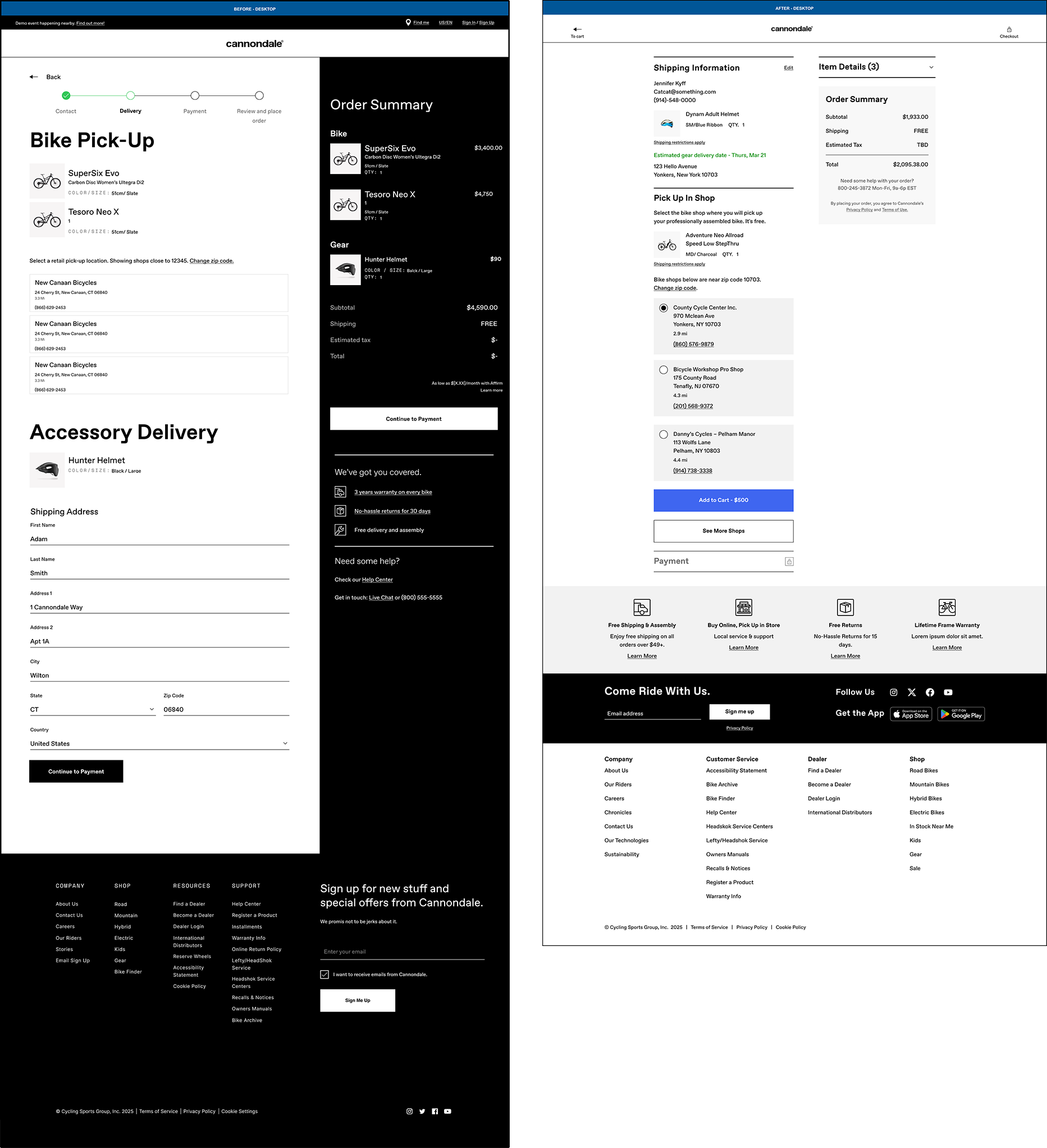
VIEW Desktop PROTOTYPE
This is a limited prototype and will open in a new tab. If you would like a walk through please contact me.
Checkout Cart Mobile
LEFT: BEFORE | RIGHT: AFTER
Checkout Cart Desktop
LEFT: BEFORE | RIGHT: AFTER
Full Case Study
RESEARCH
We researched several competitor e-commerce flows as well as big box e-commerce sites. We used user testing research to ensure best practices were being followed in the new e-commerce design. Below are the general requirements our research and collaboration generated.
General Requirements:
• Mobile-first design approach
• Adherence to e-commerce best-practice research
• Consistency within design
• Updated typography size and contrast to meet accessibility guidelines
• Implemented global styling for CTAs
• Improved tooltip messaging
• Improved error messaging
• Real-time validation messaging for password creation
• Adherence to Cannondale design standards
• Addition of cross-sell/upsell product recommendations to cart
• Make Steps easy to review and edit for users
USER TESTING
Users rated the new design very easy to use
User testing enabled two bugs to be fixed after the live launch.
MEASUREMENT OF SUCCESS
• Increased cart upsell by 5%
• Users Testing rated the new design very easy to use
• New design improved conversion by 5%
FUNCTIONALITY Updates
Sign Up/ Sign In Pages
Eliminated uneven visual weighting of user options
Accessibility improvements: elimination of white copy against black background
Picked up current design patterns and trends
Password Validation and best practices for Sign Up form
Cart
Cross-sell/upsell product carousel based on highest-value item in cart
Clearer headlines separate product by delivery method
Updated global styling applied to headlines, CTAs
Created a mobile first cart
Account Holders/ Guest Checkout
Guest Checkout integrated into the start of checkout
Implemented streamlined checkout-specific header to keep user focused within the flow
Checkout
Cart contents customize checkout flow
New mobile-friendly expand/collapse steps show user what’s ahead
Checkout - PUIS (Pick Up In Store)
Improved visual distinction between bike shop options
Headline copy clarifies delivery method
Users can easily review and/or edit previous steps
Omnipresent item details section available for expansion