
Cannondale.com Product Detail Page Refresh
My Process: The product detail page for Cannondale that hadn't been redesigned in years, so I led research by running workshops with product management, reviewed heatmaps and click data, and pulled findings from user testing. Users told us they'd bounce if specs weren't easy to find, they were getting stuck in a sizing modal they couldn't close, and mentioned that our zoom feature wasn't easy to use.
Based on these findings, I restructured the information hierarchy. I brought specs, geometry, and reviews higher up on the page, added a sticky add-to-cart nav, redesigned the sizing modal to make it easier to use and designed a new image viewer with zoom features that enabled users to see more of the bikes up close.
The Result: There was a 50% increase in clicks to product specifications, an increase in the usage of the size finder by 20%, and engagement with the product photography increased by 15%.
Case study · E-commerce · Responsive web
Rebuilding Cannondale.com checkout so riders always know where they stand
A mobile-first redesign of cart, sign-in and checkout, grounded in competitive benchmarking and Baymard research, that lifted checkout conversion by 5% and cart upsell by 5%.
My role
[Your title], design lead: research, workshops, UX, UI
Team
Product managers, [dev team size], [QA / others]
Timeline
[Year] · [Duration]
Tools
[e.g. Figma, prototyping tool, testing platform]

Outcomes at a glance
+5%
checkout conversion
+5%
cart upsell from cross-sell
“Very easy”
how testers rated the new flow
2
bugs caught in post-launch testing, fixed before wider rollout
Overview
The problem
Cannondale’s checkout was built desktop-first and it showed. Low-contrast text and inverted black-and-white fields split the page visually, sign-in options carried uneven weight, password errors were unforgiving, and once riders moved past a step they couldn’t easily go back and review it. Choosing a bike shop for Pick Up in Shop was the most confusing moment in the whole flow.
My approach
I pulled the team together and led research and workshops with product managers, benchmarking competitors, big-box e-commerce leaders and Baymard research. The goal was to ground decisions in real user behavior, not internal opinion. That evidence set six priorities that shaped every screen.
The outcome
A mobile-first cart and checkout with expandable, editable steps, a clear Pick Up in Shop flow, real-time validation and cross-sell in the cart. Checkout conversion and cart upsell both rose 5%.
01 · Discover
Start with evidence, not opinions
Checkout is the most opinion-heavy page on any store site. Everyone has a pet fix. Before touching a screen, I wanted a shared evidence base the team could point to when trade-offs came up, so I ran discovery in three tracks.
Team workshops
Led research reviews and workshops with product managers to align on what “better” meant for the business and for riders, and where the current flow was losing them.
Competitive benchmark
Walked through checkout on competitor bike brands and big-box e-commerce leaders to see which patterns riders already expect.
Best-practice research
Used Baymard’s large-scale checkout usability research to check our assumptions against documented user behavior.
ARTIFACT: competitive benchmark matrix
(competitors × patterns: guest checkout, step review, pickup, cross-sell)
ARTIFACT: annotated audit of the old checkout
(red callouts on each problem below)
What the audit uncovered
Six friction points in the old flow
Accessibility
Hard to read, visually split
Low-contrast text and inverted black-and-white fields broke the page in two and failed contrast guidelines.
Sign in / sign up
Unclear first choice
Uneven visual weighting made it hard to tell sign-in, sign-up and guest apart, at the very first step.
Errors
Unforgiving passwords
Rules surfaced only after a failed submit, and tooltips and error messages didn’t explain how to recover.
Navigation
No way to look back
Completed steps were hard to review or edit without losing your place in the flow.
Pick Up in Shop
Confusing shop selection
Bike shop options looked alike, and copy didn’t make the delivery method clear. Users got lost here most.
Mobile and cart
Desktop-first, missed add-ons
The cart wasn’t built for phones, and nothing helped riders catch items they might need with their purchase.
02 · Define
How might we get riders from cart to confirmation with confidence, on any screen?
I turned the friction points into six priorities the team agreed on. They became our yardstick: every design decision had to serve at least one.
1
Mobile-first rebuild
Design for the smallest screen first, then scale up.
2
Accessible by default
Updated type size and contrast to meet accessibility guidelines.
3
Forgiving errors
Real-time password validation, clearer tooltips and error messages.
4
Reviewable steps
Expand, review and edit any step without losing your place.
5
Clear Pick Up in Shop
Make choosing a bike shop obvious and the delivery method unmistakable.
6
Helpful cross-sell
Surface relevant add-ons in the cart without distracting from checkout.
Guardrails throughout: consistency, global CTA styling, and Cannondale’s brand standards.
03 · Ideate
Mapping the flow before the pixels
[Describe how you explored: user flow mapping, sketches, wireframe options you considered and what you ruled out, and why. One rejected idea with its reason shows judgment better than any final screen.]
ARTIFACT: end-to-end user flow
Cart → Sign in / Guest → Delivery (Ship or Pick Up in Shop) → Payment → Review → Confirmation
ARTIFACT: low-fi wireframes, mobile steps
ARTIFACT: explored vs. chosen option
(e.g. single long page vs. expand/collapse steps)
04 · Design
Five key decisions, before and after
Each decision traces back to a priority from the Define phase.
Decision 1 · Priorities 2, 3
Sign in and sign up that treat every option fairly
Problem. Uneven weighting and white-on-black copy made the first choice in checkout harder than it should be.
What I did. Balanced the visual weight of the options, removed white copy on black backgrounds, updated to current patterns, and added real-time password validation that shows the rules as you type.
Why. People shouldn’t fail a password rule they were never shown. Validating as they type turns an error into guidance.
BEFORE: sign in / sign up
Before
AFTER: sign in / sign up with live validation
After
Decision 2 · Priority 1
Guest checkout up front, distractions out
Problem. Riders who just wanted to buy had to work around account prompts, and the full site header pulled attention away from finishing.
What I did. Integrated guest checkout into the start of the flow and designed a streamlined, checkout-specific header.
Why. Forced account creation is a well-documented cause of abandonment. A focused header keeps people moving forward.
BEFORE: checkout entry + header
Before
AFTER: guest option + focused header
After
Decision 3 · Priorities 1, 6
A mobile-first cart that helps riders catch what they missed
Problem. The cart wasn’t built for phones, mixed items by delivery method without explanation, and offered no relevant add-ons.
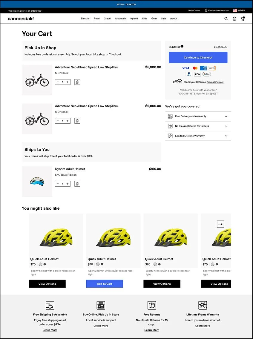
What I did. Rebuilt the cart mobile-first, added clear headlines separating items by delivery method, applied global styling to headlines and CTAs, and added a cross-sell carousel based on the highest-value item in the cart.
Why. Basing recommendations on the main purchase (usually the bike) keeps them genuinely useful rather than noisy.

Before, desktop. Small all-caps labels and a heavy black summary column split the page in two.

After, desktop. Delivery-method headlines, a light summary panel and cross-sell below the cart.

Before, mobile. Oversized images push the summary and checkout button far down.

After, mobile. Compact rows, clear groups, and recommendations based on the bike.
Decision 4 · Priorities 1, 4
Expand and collapse steps that show what’s ahead
Problem. Riders couldn’t see what was coming or go back to check an earlier step without losing their place.
What I did. Designed mobile-friendly expand/collapse steps, let cart contents customize which steps appear, and added an always-available order summary panel.
Why. Seeing the whole path, and being able to revisit any part of it, is what gives people confidence to hit “Place order.”

Before, mobile. Every step stacked into one long page, with the order summary far below.

After, mobile. Done steps stay visible with Edit; upcoming steps and item details wait collapsed.
Decision 5 · Priority 5
Pick Up in Shop, made unmistakable
Problem. This was where users got most confused: shop options blurred together, and it wasn’t clear the bike would be picked up rather than shipped.
What I did. Gave each bike shop option clear visual distinction, rewrote headline copy to state the delivery method, kept previous steps reviewable and editable, and added an omnipresent, expandable item details section.
Why. Picking up a bike is a real-world commitment to a place and time. Riders need to be sure which shop they chose before they pay.

Before. Three look-alike shop boxes with no selection control, and no word on what pickup means.

After. Radio-select shop cards with distance and phone, copy that says it’s free assembly and pickup, and the summary always in view.
05 · Validate
Testing the live flow with real users
After launch, I ran a round of user testing to validate the redesign. [Add method: number of participants, moderated or unmoderated, tasks you asked them to complete.]
Rated “very easy to use”
Qualitative feedback confirmed the flow felt clear from cart to confirmation.
Two bugs caught early
Testing surfaced two bugs we fixed before they reached a wider audience. [Briefly name them.]
Tester quote
“[Add a real participant quote here. One line in a user’s own words is persuasive.]”
06 · Measure
A clearer, mobile-first checkout performs better
+5%
Checkout conversion
+5%
Cart upsell
Very easy
User testing rating
Beyond the numbers, consistent CTA styling, real-time validation and the order summary panel gave riders confidence about exactly where they stood in the process.
What I learned
[Lesson 1]
[e.g. what shared research did for team alignment and decision speed]
[Lesson 2]
[e.g. why testing after launch still paid off]
What I’d do next
[e.g. a follow-up you’d test, or a metric you’d track]
Constraint I worked within
[e.g. platform limits, timeline, brand standards]
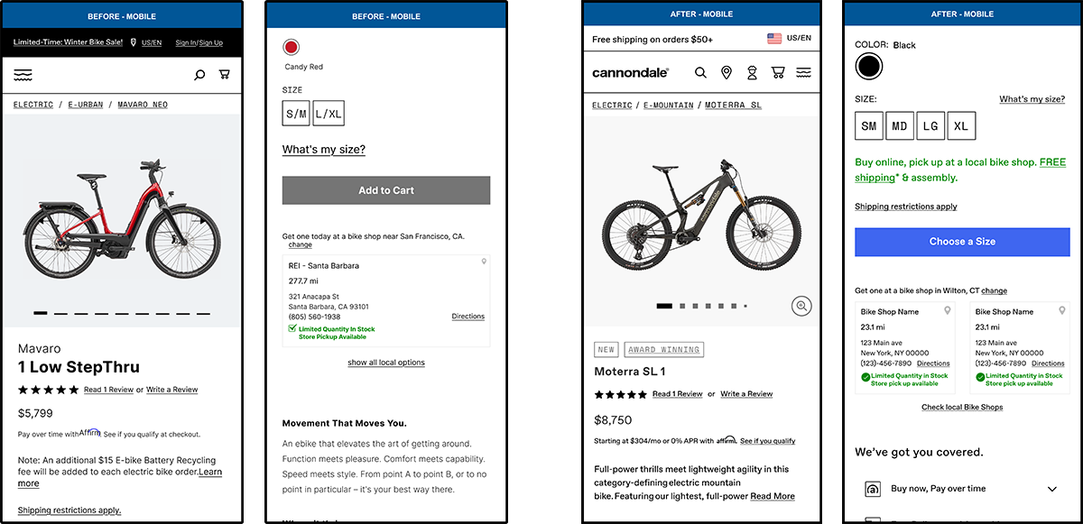
MOBILE
LEFT: BEFORE | RIGHT: AFTER
VIEW MOBILE PROTOTYPE
This is a limited prototype and will open in a new tab.
Desktop
LEFT: BEFORE | RIGHT: AFTER
VIEW Desktop PROTOTYPE
This is a limited prototype and will open in a new tab. If you would like a walk through please contact me.
Full Case Study
RESEARCH
i conducted a brainstorming workshop in fig jam between UX and Product Management to align on goals for the PDP refresh project. Together we reviewed heat maps and click maps generated from hot jar as well as reviewed current design patterns for both competitors and non-competitor’s PDP pages. Below are the goals our research and brainstorming generated.
• Optimize above the fold
• Understand images we have & how to make them better / better showcase our bike visually to our customers. Better photo experience on PDP.
• Offer our users a better sizing experience on PDP
• Get users to checkout/conversion as quickly as possible
• Getting users to understand delivery methods
• Users understand the Cannondale reasons to buy (brand strength & communication of standing behind product)
• How to optimize the spec data so that users understand what they’re getting in their Cannondale purchase
• Incorporating ways to zoom into the product more efficiently will help users see features of the bikes more easily.
USER TESTING
I gathered findings across a couple years of our general “Find my Bike” user tests. Some of findings that helped inform our design designs on the PDP redesign are as follows:
• Reviews are very important to users when considering a purchase
• Users mentioned that they would leave a page if specs and technical information were not easier to find.
• Users struggled with the current UI design of the sizing modal. They couldn’t close out of the modal easily on desktop. Reading the results of the chart were not always clear. Content was cut off on mobile due to unnecessary spacing at the top of the viewport.
REQUIREMENTS
• We wanted to optimize scroll depth and above the fold
• Enhance product discovery through updated content organization and UI design
• Optimize information hierarchy while working within our existing content framework
• Maintain strong conversion rates
• Modernizing the overall look and feel
• Enhancing our product photo experience
• Updating the the sizing experience so it’s easier to use
• Get users to checkout/conversion as quickly as possible
• Getting users to understand delivery methods
• Ensure users understand the Cannondale reasons to buy to increase brand strength & communication for our products
• Optimizing the spec data so that users get the information they need for the product they are researching/ buying
FUNCTIONALITY Updates
• Increased the visibility of the following areas: Specs, Geometry and Reviews by bringing them higher up on the page so the user can get to the information quickly.
• Implemented a drop down navigation to appear when the user scrolls past the ATC button so that they can easily add the product to cart where ever they are on the page.
• Added the image viewer with a zoom feature so the user could examine the details of the bikes components more closely.
• Added an Overview paragraph to the right rail so users can be brought to the key information about the bike faster
• Added reasons to buy drawers so the user could view our reasons to buy more easily.
• Redesigned the “What’s my size?” modal so users could quickly close it when needed and not get trapped within a modal they can’t close.
MEASUREMENT OF SUCCESS
• Increased the views to product specs by 50%
• Increased the usage of the size finder by 20%
• Engagement with the product photography increased by 15%